Design Principles Document
Sebastião J. Matusse
Visual Hierarchy
BYU-Pathway Worldwide

Visual Hierarchy is very important principle because it gives
hints to the user how you want them to navigate the website -
where to read, to click, etc.
Visual-hierarchy means how the elements in the website page are
organized, in order of importance, to guide the user. And this can
be done using:
- Size
- Color
- Contrast
- Proximity
- and many others
In the image example above we see that in the nav bar, the logo
and the "Apply For Free" button stand out because of the
bright yellow Color on them that
contrasts very well with the white color. And the
size of the logo makes it stands out relatively
more. Goind slightly down, our attention is drawn to the
"Begin Today" button because of its color that stands
out.
The same pattern is seen along the whole website.
Alignment
BYU-Pathway Worldwide

BYU-Pathway Worldwide demonstrate strickly well the web design of
Alignment.
Alignment is basically to line up webpage elements. The elements
can be vertically or horizontally aligned. We have vertical
alignment when the elements stay on an invisible straight line
from top to botton. This can be see the image above, the three
elements are properly vertically aligned.
The horizontal alignment is the opposity. We have the vertical alignment when the elements stay on an invisible straight line from right to left. In the image above we cannot see that alignment in mobile view, but in the desktop or tablet version, we cn see that alignment.
We can also have the edge alignment, where the elements are all
aligned to the left, right or center, however, we can have both,
left and right edges aligned (justified).
The three elements in the image above, the dollar sign icon, the
computer icon and the temple icon are all center aligned (they
line up on an straight center line), and their description text is
justified.
Hick's Law
Pixlr
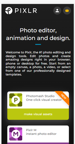
Hick's Law
Hick's Law says that with every additional choice increases the
time required to take a decision.
pixlr.com applies well that law, it keeps simple and
straightfoward options for the user. Allowing the user to keep on
the site and having a great experience.